It started with a road trip through the Pacific Northwest.
I was originally hired at XebiaLabs as a product designer, the first member of a new team that was going to launch a DevOps reporting tool. I hit the ground running, launching a discovery research effort to go on site with customers, diving deep into their current workflows, organizational constraints, and biggest questions to understand what our users needed in the data reporting space (that road trip I mentioned). Perhaps unsurprisingly, what I found was that our users didn’t need reports–they needed help. In fact, the most common question I heard during research was “we’re doing DevOps…now what?” The problem was that large organizations adopting DevOps practices were introducing a lot of new processes and tools to their teams, and then struggling to understand how to optimize and improve after the initial implementation. Other users I spoke with felt pressured to show improvement and ROI for their DevOps initiatives, but they were struggling to paint a picture of the whole process based on the disparate logs they could access from individual development tools.
So the design that took shape from this research focused on not just visualizing data, but providing insight; essentially, putting the human back into the loop of the DevOps process to help users understand and act on the data available from across their toolchain. My approach focused on guiding the user through a story built out of their data, highlighting action targets related to the user’s current goals and domain KPIs. This goal focus evolved throughout iteration to become a central component of the product design, enabling users to select goals currently of interest to their organization and track relevant metrics, trends, and suggestions based on those choices.

example research deliverable: primary persona
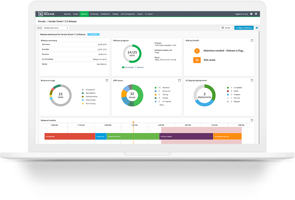

screenshot from the proof of concept implementation
A key piece of this product from the beginning was the vision that the data should not just come from our tools, but from any tools essential to the DevOps process. After the initial research, brainstorming, and sketching process I collaborated with my development team to ensure that our tool could integrate and normalize data from a variety of sources in order to provide process-wide insights, not just tool-specific ones. As this had never been done before, we started with a proof of concept to test both our data processing plan and the goal-based dashboard idea.
The proof of concept was internal, leveraging subject matter experts to provide feedback on how well we’d captured the DevOps domain and our Customer Success team to provide feedback on the overall idea based on their user knowledge. From the proof of concept, we established that the overall plan was heading in the right direction, but that both the visualization and the data designs needed some tweaking, such as:
making the central goal clearer to the user
generally making the page easier to follow
targeting metrics based on each goal
combining data further to support a holisitic view of the process
Moving towards the first “full” version of the product (our beta), I worked with several people to improve on the initial design. First, I worked with external subject matter experts from inside and outside our user base to amp up the focus on KPIs and improve how we guided users around specific goals. These sessions were carried out as remote co-design workshops were we discussed the field, the participant’s experience leading DevOps transformations, listed out the most important goals, and then brainstormed the data and metrics that would support each goal.

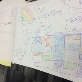
virtual working session: BOS-NDL
After the proof of concept evaluation, we entered a new phase for the project focused on preparing for launch. To that end, I brought in Nadia (who handled most of the final visual design for XL products). We collaborated on updating the visual design of each goal view, building high-fidelity mockups in Adobe Photoshop. We validated the new designs with internal stakeholders from across each department (Sales, Marketing, and Customer Success) as well as select target users from the XL User Panel.
After we finalized the visual improvements, I broke each goal view into small sections (e.g., by tile type, chart, data needs) and made Jira tickets for the development team to implement. As implementation continued, I worked on recruiting users from our XL User Panel to participate in the Beta program. The research plan for the Beta includes:
quantitative metrics:
expectation rating, overall ease rating, SUS
qualitative measures:
weekly check-ins (short interviews) to discuss ongoing feedback, initial onboarding follow-along, post-beta interview and discussion
As this product will be our first SaaS and cloud-based tool, the recruitment process was also vital for giving us a sense of the types of questions potential customers would ask about the product. So in addition to getting research ready to test the product, I also worked on driving the creation of customer support documentation such as SaaS vendor assessments, data security and privacy explanations, and onboarding checklists. These documents will be used with Beta participants and updated as we iterate on the procedures for new customers. Beta testing includes quantitative (expectation ratings, task ease ratings, NPS) and qualitative (user interviews, onboarding shadow, open comments) measures to support iteration. We will also use these initial quantitative measures to establish a benchmark we can compare with in 6 months.
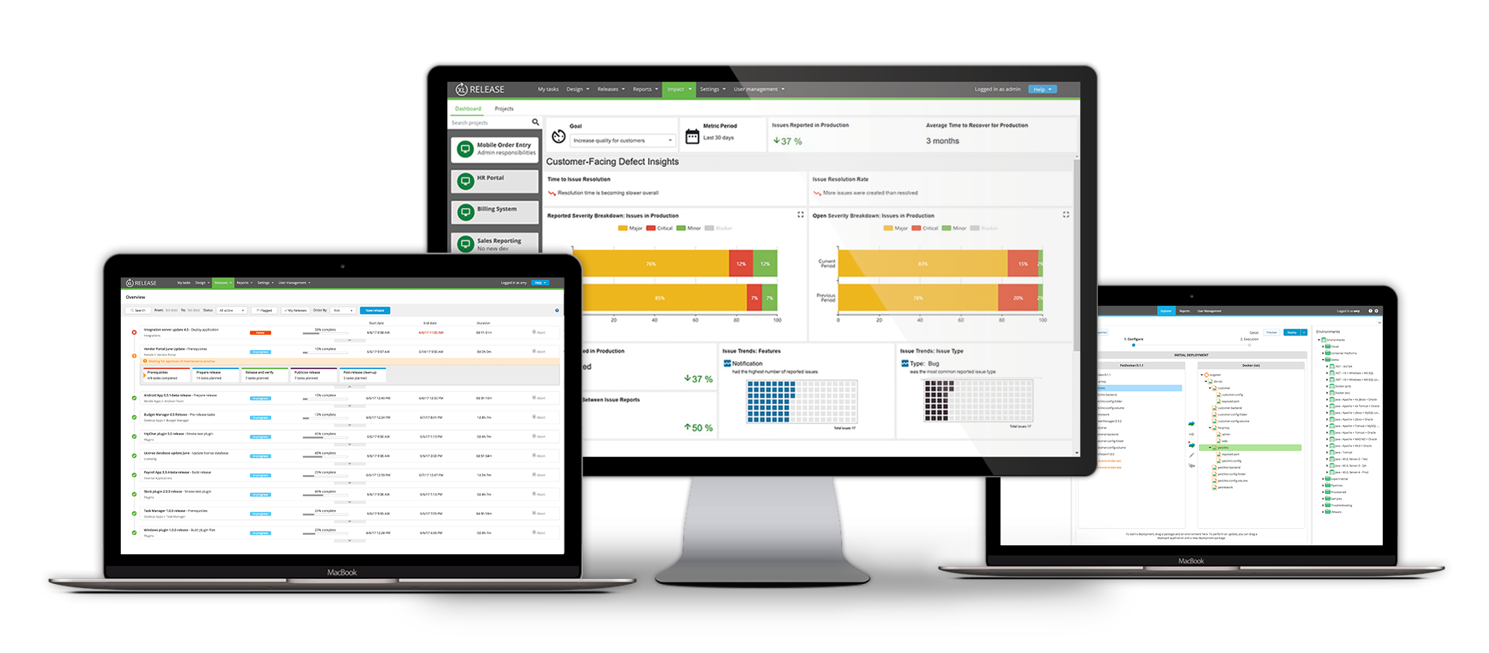
XL Impact launched November 13, 2017. You can find official product information on the XebiaLabs website.

photoshop mockup for the final design

image of KPI tracking from XebiaLabs website